
提示词美学解码 × 瑞士国际主义 _ 信息的秩序
很多文章封面的问题,并不在于设计元素不足,在于信息没有被有效组织。 标题很大,但阅读顺序不清,有配图,但功能不明确,缺少稳定关系。
对于科技文章、商业分析、方法论、研究报告、AI 工具拆解,瑞士国际主义通常比复古插画、赛博风、复杂拼贴更合适,不强调装饰效果,重点是信息秩序。
本文聚焦一个问题:如何把瑞士国际主义拆成可执行的生图提示词,用在海报、文章封面和视觉主图里。
1. 何为"瑞士国际主义"
瑞士国际主义,也常被称为 International Typographic Style / Swiss Design,是二战后瑞士和德国设计师将现代主义平面设计进一步系统化形成的视觉传达方法。
它强调中立、客观、理性规划、模块网格、无衬线字体、非对称版式、清晰信息层级和相对客观的图像使用。
它适合海报和封面,因为这类画面经常要同时处理标题、图像、编号、时间、说明文字和机构信息。瑞士国际主义提供的不是单一版式,而是一套让多层信息形成稳定关系的视觉方法。
重点不是减少元素,而是用网格、比例、字体尺度、图形和色彩建立清晰关系。
2. 适用场景
内容类型是否适合为什么科技文章、AI 工具、效率方法适合秩序感强,有助于提升工具类内容的可信度商业分析、行业报告、数据观点适合网格、留白和层级适合承载数字、标题、注释和摘要信息设计史、字体、排版、品牌系统文章适合风格本身就是现代平面设计和视觉识别的重要语境个人成长、知识管理、工作流方法适合抽象方法需要结构化呈现,这类风格能帮助建立框架情绪化散文、亲密关系、疗愈内容不适合视觉过于冷静,容易削弱情绪表达潮流娱乐、强冲突热点、夸张表情包不优先过于克制,不如波普、孟菲斯或新粗野主义有即时刺激高奢、电影、夜生活、仪式感主题边界使用可以做高级理性版本,但不适合表现华丽、性感和戏剧性需要复杂故事场景的封面不适合瑞士国际主义更适合信息结构,不适合多人物叙事插画
使用边界:如果目标是可信、清楚、专业、可读,它的适配度高;如果目标是强情绪、强故事、强装饰,它不是第一选择。
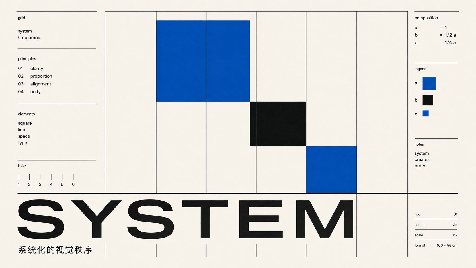
3. 核心视觉特征拆解构图
重点是网格。标题、图片、短说明、日期、编号、品牌信息,都应受同一套网格约束。画面可以不居中,但关系要明确。
strict modular grid, asymmetric layout, rational hierarchy, aligned text blocks, generous margins
字体 / 文字关系
文字是画面结构的一部分,而非附加说明。
做法是单一无衬线字体、两级字号;标题承担主结构,小字进入辅助层级。字重中等,重美术黑体会让中文偏标语感。
one medium-weight grotesk family, two type sizes, flush-left, Latin headline plus small Chinese line
色彩
配色克制,但强调色常以大面积平涂出现,而非小面积点缀。常见做法是一个高饱和色(红、黄、钴蓝)铺满主场,黑与米白承担文字和图形;颜色平涂、硬边、无渐变。
one large flat saturated color field, black and off-white, hard edges, no gradients
图形
主视觉可以是几何系统(成组的弧线、方阵、色带,按数学级数排列)、被放到结构尺度的单个大形,或客观硬裁的摄影。三条路都成立,关键是成系统或成结构,而非装饰。
关键不在图形数量,而在是否承担信息功能:引导视线、划分区域、强调标题、连接图文。
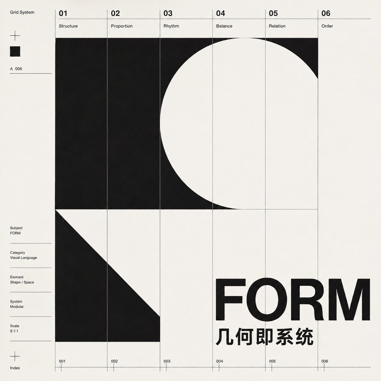
systematic geometric composition, concentric arcs / nested squares / progressive bands, thin functional rules
留白
留白是版式的一部分。
瑞士国际主义的专业感主要来自边距、栏距、行距和空白区域的控制。提示词里应明确 generous margins,否则模型容易把画面填满。
材质 / 质感
质感以干净的平面印刷为主。可以有纸面感,但不要脏纸、胶片刮痕、3D 光泽、玻璃拟物和复杂阴影。
no vintage paper texture, no glossy 3D, no heavy shadows, no grunge noise
情绪气质
冷静、客观、专业、可信、有编辑判断;它的情绪表达克制,适合传达清晰、理性和可读性。
避免误用:1. 把瑞士国际主义等同于白底黑字。 2. 只写 Helvetica,但不写网格和层级。 3. 加太多装饰线条、复古纹理和无意义编号。 4. 用厚重美术黑体堆中文大字,丢掉字号层级和字距控制,画面退回标语感。 5. 所有元素都居中,做成普通海报模板,丢掉非对称的信息结构。
4. 提示词编译方法
提示词不需要逐条展开所有规则。验证下来稳定的骨架是这几个字段:
设计师锚点 + 画幅 + 主视觉(几何系统)+ 配色 + 排印(拉丁主标/中文小标)+ 网格与留白 + 文字控制 + 禁止项
表现取向
这些不是四个独立历史流派,而是提示词里的表现取向:
表现取向是否属于瑞士国际主义语境使用条件关键词信息结构型属于核心用法适合报告、招生、科技、方法论strict modular grid, systematic geometric marks, thin functional rules几何海报型属于瑞士现代主义海报语境保留网格、无衬线字体、清晰层级,几何成系统做主视觉dense progressive geometric system, one flat saturated color field, strong poster impact字体图形型属于字体海报方向标题或字母成为主视觉,但仍保持可读和对齐关系cropped oversized typography, type as image, strong scale contrast瑞士新浪潮延伸型不等同于经典瑞士国际主义只在设计、音乐、文化、实验主题中使用;底层仍保留网格逻辑controlled grid disruption, rotated user-provided labels, layered typographic fragments
如果文章主题偏知识、报告、机构信息,用信息结构型或几何海报型。
如果主题本身与设计、音乐、视觉实验有关,再使用瑞士新浪潮延伸型。
完整简易提示词结构(复制即用)
复制后替换 {},每组选项只选一个方向,不要全部塞进去。下面这套骨架就是第 6 节五个案例共用的结构。
骨架分两层:锁死的风格内核(每条必带)和自由变量(按画面需要选)。
INPUT:
请根据我输入的一句话生成封面。例如:“横板5:2,生成一张瑞士风格文章封面,标题是:信息的秩序。”

TASK:
根据 INPUT 自动识别画幅比例、封面用途、中文标题,并生成一张瑞士国际主义风格文章封面。

自动处理规则:

* 画幅:根据 INPUT 中的“横板、竖版、方图、5:2、16:9、4:5、1:1”等信息决定。
* 中文标题:使用 INPUT 中给出的标题。
* 英文标题:根据中文标题自动提炼一个简洁英文词或短语,作为视觉主标题。例如「信息的秩序」可转化为 “ORDER” 或 “ORDER IN INFORMATION”。
* 风格:1950s Swiss International Typographic Style,理性、客观、非对称、网格化、平面化。
* 构图:自动选择最适合标题的几何系统,例如模块网格、数学弧线、比例色块、圆形、矩形、线性结构、文字构成。
* 色彩:暖白、黑色,加一到两种克制的高饱和强调色,如红色、钴蓝、黄色或橙色。
* 字体:只使用一种中性无衬线字体;中文为干净现代无衬线,不使用书法体、宋体、装饰字体或厚重海报字。

IMAGE STYLE:
Create an authentic 1950s Swiss International Typographic Style article cover. Use a strict modular grid, precise alignment, asymmetric composition, flat geometric forms, strong typographic hierarchy, and structural negative space. The design should feel rational, editorial, disciplined, and designed through a Swiss grid system.

DOMINANT VISUAL:
Create one clear visual system based on the title: mathematical arcs, progressive circles, modular grid fields, proportional bands, geometric blocks, thin rule lines, or typography as image. The visual must be systematic, flat-painted, and locked to the grid. Avoid decorative illustration.

TYPOGRAPHY:
Use one grotesk sans-serif type family only. The English headline should be large and dominant. The Chinese title should be smaller and aligned to the same grid near the headline. Use scale, position, and spacing to create hierarchy, not decoration.

COLOR:
Limited flat palette only: warm off-white, black, and one or two saturated accent colors. Hard edges. No gradients, no shadows, no 3D, no glass effect, no neon, no texture, no paper grain, no vintage grunge.

TEXT RULE:
Use only title-related text. Do not invent dates, issue numbers, URLs, logos, page numbers, fake captions, random labels, or meaningless characters.

AVOID:
Modern minimalist AI poster, PowerPoint layout, brochure template, cute isolated icon, stock photo look, decorative illustration, gradient, 3D, drop shadow, paper grain, grunge texture, heavy CJK display type.

QUALITY:
Sharp edges, precise grid alignment, flat offset-print feeling, clean hierarchy, editorial article-cover quality.
5. 结构规范:
一、锚定设计师而不是锚定名词:Swiss style 这个流派名模型见得太多、已经被平均化,会退回当代极简。第一行直接指名:in the manner of Josef Müller-Brockmann / Armin Hofmann / Emil Ruder / Max Bill,方向立刻收窄到具体的人和具体的海报机制。
二、成系统或成结构的几何:写 a dense progressive system of dozens of arcs / squares / bands on mathematical progression,或 one or few boldly scaled forms with large structural negative space。两条路都成立;要避免的是孤立的卡通式图标,而不是元素少。
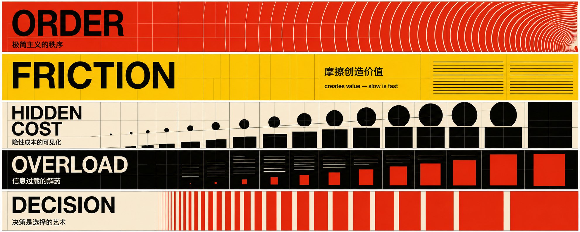
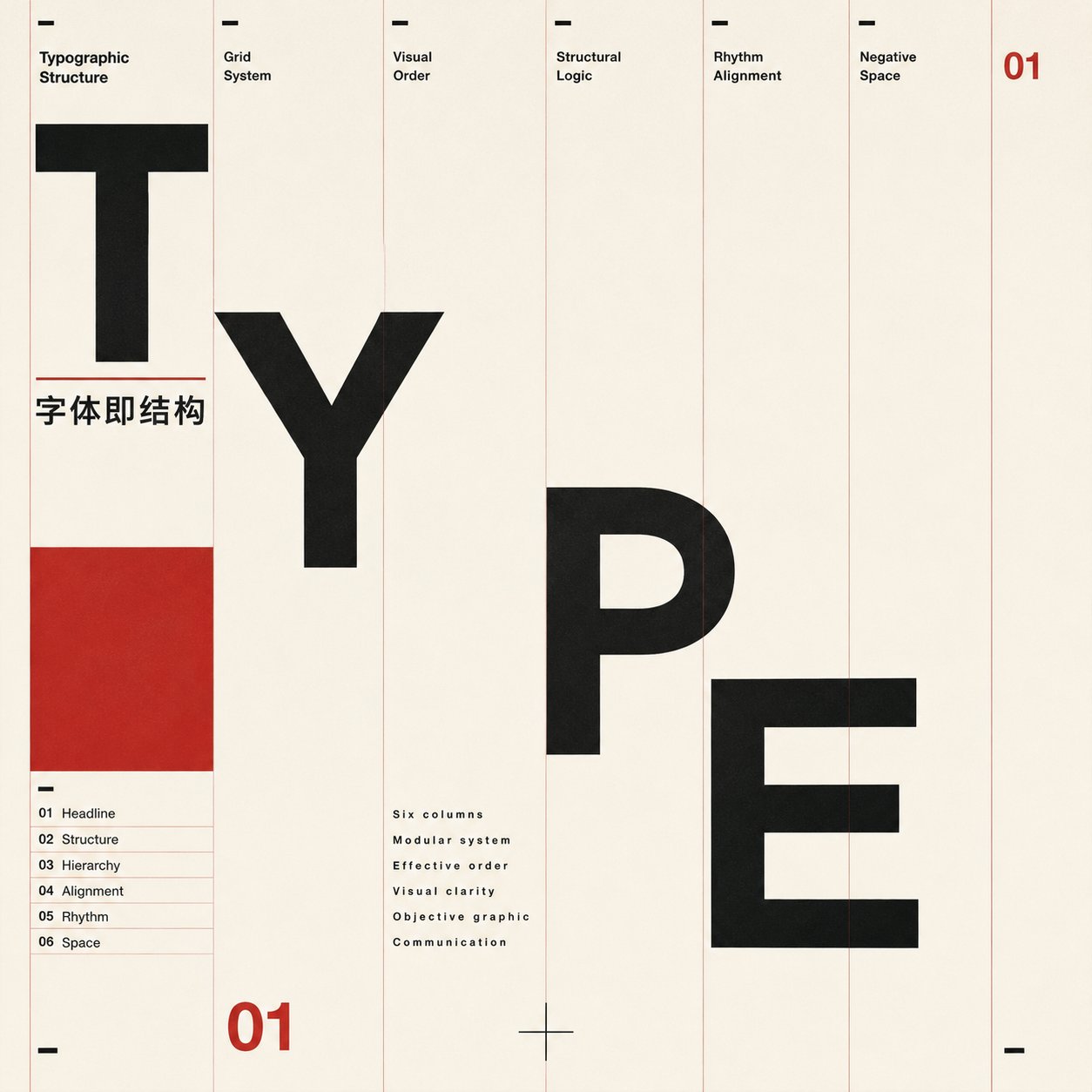
三、文字信息秩序:瑞士排印的节奏长在拉丁字母上,纯中文大字容易变成标语。更稳的做法是:大拉丁词当主视觉冲击(ORDER、FRICTION),一行小中文交代主题(「极简主义的秩序」),两者锁在同一套网格、同一个无衬线字体、不同字号。标题位置不必固定左上——顶部、底部、竖排、贴某一栏都行,只要对齐网格、与几何形成平衡。中文受众看懂意义,画面拿到瑞士纹理。
四、留白要被网格定义:写 negative space is structural, grid-defined and balanced。大留白本身不是问题,要避免的是没经营的死空——留白要被网格切分、和主体形成平衡。
字体补充:medium-weight grotesk, tight optical spacing,避免重美术黑体。把这四个动作叠进基础结构,画面就会从「干净」走到「有秩序的密度」。
6. 案例演示(实测成图 + 复制即用提示词)
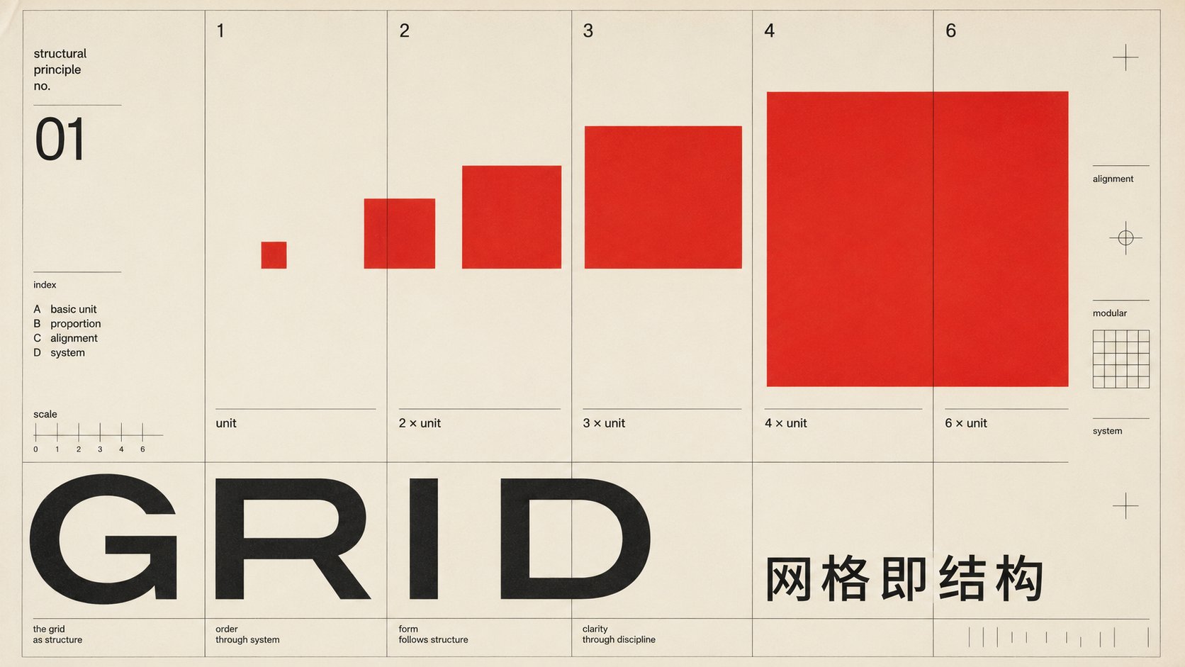
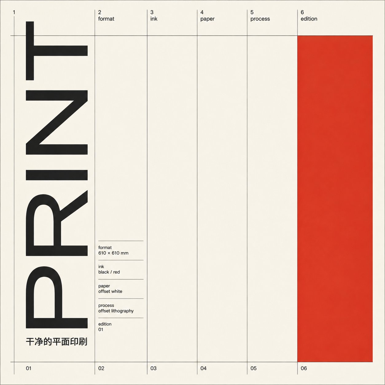
案例一:GRID · 纯网格 / 黑白红(Müller-Brockmann der Film)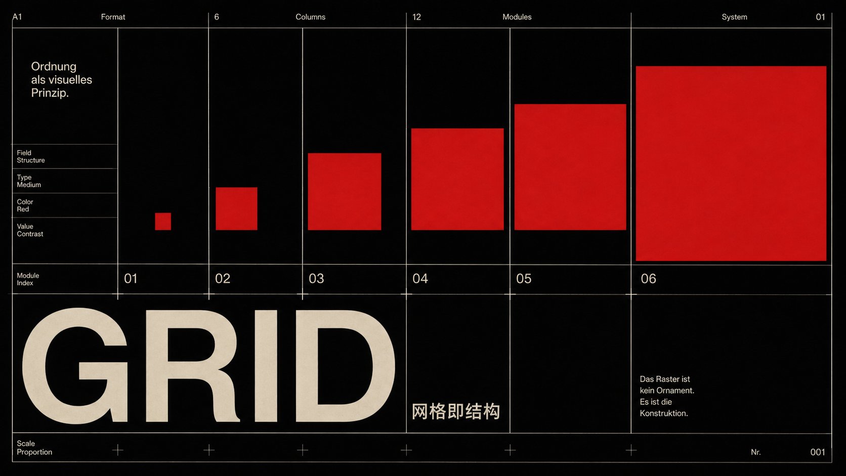
STYLE ANCHOR — in the manner of Josef Müller-Brockmann der Film: mathematical grid, systematic geometry, type as structure.

A 16:9 landscape Swiss International Typographic Style poster — authentic 1950s offset print.

LOCKED — everything aligns to one underlying modular grid; one grotesk sans-serif family only; flat color with hard edges; no gradient, 3D, shadow, texture or ornament; objective, rational, asymmetric.

DOMINANT VISUAL — a dense strict multi-column modular grid as the protagonist, with flat geometric marks of progressing size snapping to columns and one flat red form used structurally.

COLOR — black field; warm off-white type; one flat saturated red accent used structurally. Hard edges, no gradients.

TYPOGRAPHY — one neutral grotesk family, medium weight, tight optical spacing, two or three sizes; hierarchy by scale and position, not decoration.
  · Latin headline "GRID" placed large in a lower band across the left columns on the grid, grid-aligned; small Chinese line 「网格即结构」 on the same grid nearby.

GRID & SPACE — the modular grid governs every element; negative space is structural, balanced, grid-defined.

SECONDARY LAYERS — add controlled secondary and tertiary layers (thin rule lines, small Latin field labels, modular numbers, alignment marks, tiny captions) to increase editorial richness while staying rational, objective and grid-locked.

TEXT — main title must render exactly: "GRID" and 「网格即结构」. Small grid-aligned Latin field labels, numbers, index marks and thin captions are allowed — functional, like a Swiss editorial information system; no random dates, URLs, fake brand names, long paragraphs, QR codes or decorative icons; avoid small Chinese for secondary text.

AVOID — Bauhaus module matrix / pattern board; De Stijl primary-color blocks; Op Art spiral; data-chart / bar-chart look; brand-style diagonal ribbon or logo-like single form without grid function; modern minimalist AI poster; PowerPoint / brochure template; gradients; 3D; drop shadows; vintage grunge; heavy / bold display CJK type.

QUALITY — authentic 1950s Swiss offset print, sharp edges, precise alignment, flat color.
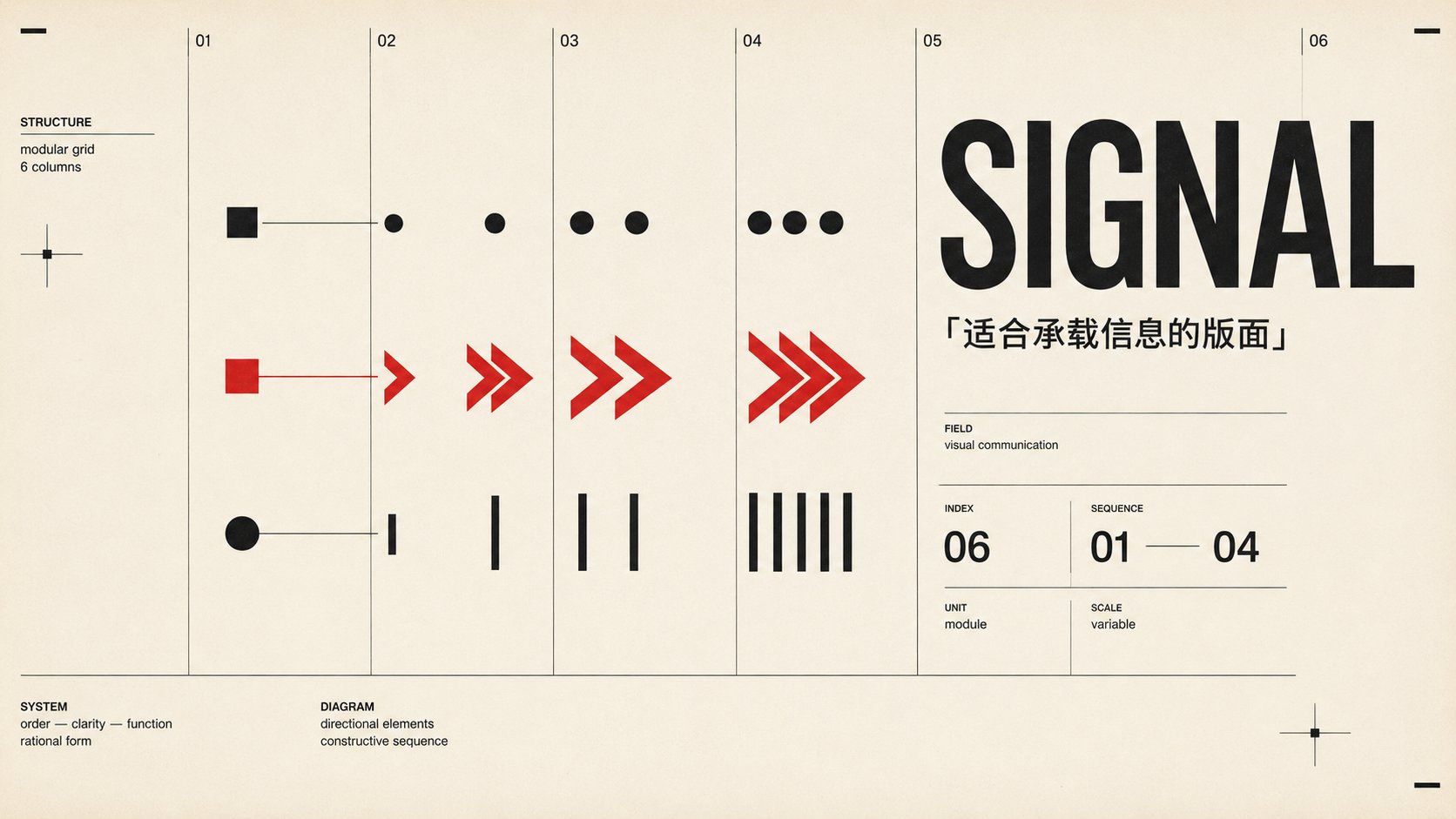
案例二:SIGNAL · 图解过程 / 米白红(Anton Stankowski)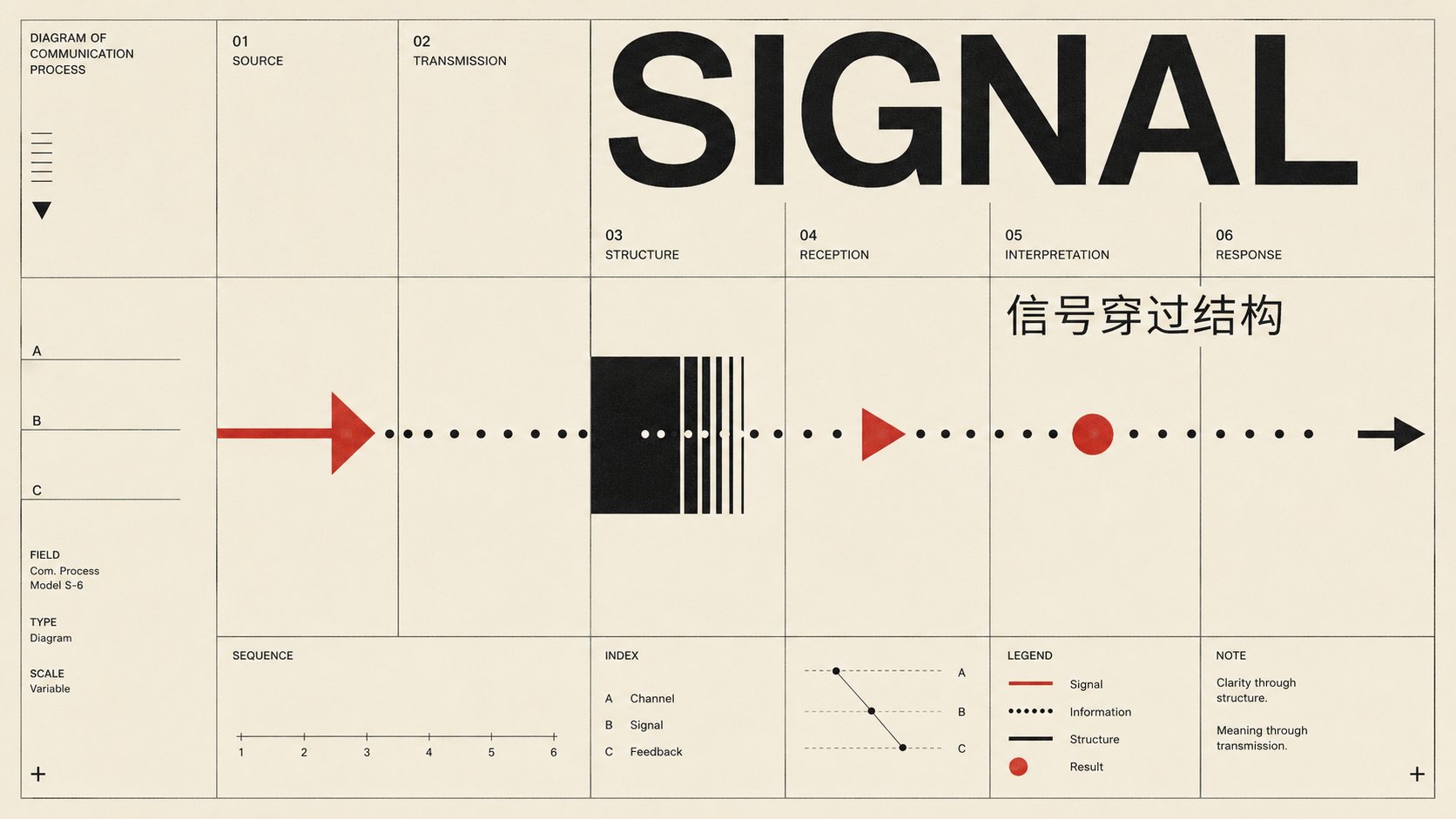
STYLE ANCHOR — in the manner of Anton Stankowski: constructive graphics, diagrammatic marks visualizing a process.

A 16:9 landscape Swiss International Typographic Style poster — authentic 1950s offset print.

LOCKED — everything aligns to one underlying modular grid; one grotesk sans-serif family only; flat color with hard edges; no gradient, 3D, shadow, texture or ornament; objective, rational, asymmetric.

DOMINANT VISUAL — constructive marks — a few arrows, fields, dots and connectors — visualizing one process or relationship, flat-painted and snapped to the grid, restrained, never a complex circuit diagram.

COLOR — warm off-white field; black; one flat saturated red accent used structurally. Hard edges, no gradients.

TYPOGRAPHY — one neutral grotesk family, medium weight, tight optical spacing, two or three sizes; hierarchy by scale and position, not decoration.
  · Latin headline "SIGNAL" placed across the top columns on the grid, grid-aligned; small Chinese line 「信号穿过结构」 on the same grid nearby.

GRID & SPACE — the modular grid governs every element; negative space is structural, balanced, grid-defined.

SECONDARY LAYERS — add controlled secondary and tertiary layers (thin rule lines, small Latin field labels, modular numbers, alignment marks, tiny captions) to increase editorial richness while staying rational, objective and grid-locked.

TEXT — main title must render exactly: "SIGNAL" and 「信号穿过结构」. Small grid-aligned Latin field labels, numbers, index marks and thin captions are allowed — functional, like a Swiss editorial information system; no random dates, URLs, fake brand names, long paragraphs, QR codes or decorative icons; avoid small Chinese for secondary text.

AVOID — Bauhaus module matrix / pattern board; De Stijl primary-color blocks; Op Art spiral; data-chart / bar-chart look; brand-style diagonal ribbon or logo-like single form without grid function; modern minimalist AI poster; PowerPoint / brochure template; gradients; 3D; drop shadows; vintage grunge; heavy / bold display CJK type.

QUALITY — authentic 1950s Swiss offset print, sharp edges, precise alignment, flat color.
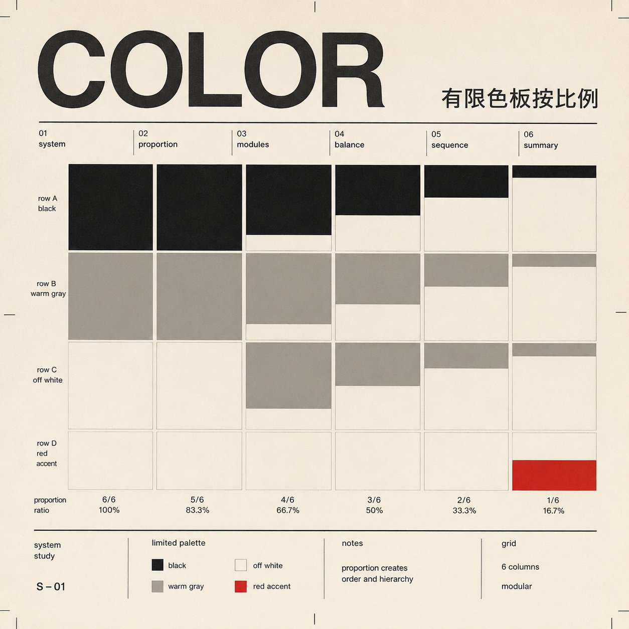
案例三:COLOR · 序列比例 / 黑白灰+单红(Richard Paul Lohse)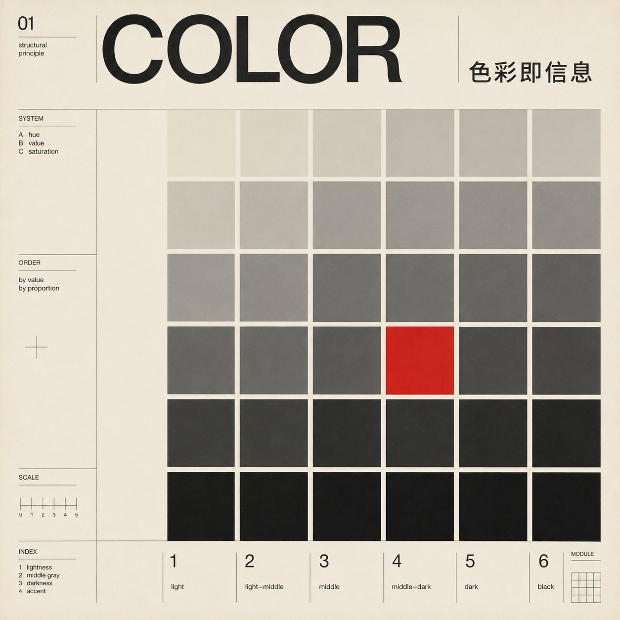
STYLE ANCHOR — in the manner of Richard Paul Lohse: concrete art, serial and modular color systems.

A 1:1 square Swiss International Typographic Style poster — authentic 1950s offset print.

LOCKED — everything aligns to one underlying modular grid; one grotesk sans-serif family only; flat color with hard edges; no gradient, 3D, shadow, texture or ornament; objective, rational, asymmetric.

DOMINANT VISUAL — a modular grid of flat color cells in a serial, systematic color progression, ordered by proportion, with one cell carrying a single flat red.

COLOR — warm off-white field; black and graded grays; one flat saturated red accent. Hard edges, no gradients; never De Stijl red-yellow-blue.

TYPOGRAPHY — one neutral grotesk family, medium weight, tight optical spacing, two or three sizes; hierarchy by scale and position, not decoration.
  · Latin headline "COLOR" placed across the top columns on the grid, grid-aligned; small Chinese line 「色彩即信息」 on the same grid nearby.

GRID & SPACE — the modular grid governs every element; negative space is structural, balanced, grid-defined.

SECONDARY LAYERS — add controlled secondary and tertiary layers (thin rule lines, small Latin field labels, modular numbers, alignment marks, tiny captions) to increase editorial richness while staying rational, objective and grid-locked.

TEXT — main title must render exactly: "COLOR" and 「色彩即信息」. Small grid-aligned Latin field labels, numbers, index marks and thin captions are allowed — functional, like a Swiss editorial information system; no random dates, URLs, fake brand names, long paragraphs, QR codes or decorative icons; avoid small Chinese for secondary text.

AVOID — Bauhaus module matrix / pattern board; De Stijl primary-color blocks; Op Art spiral; data-chart / bar-chart look; brand-style diagonal ribbon or logo-like single form without grid function; modern minimalist AI poster; PowerPoint / brochure template; gradients; 3D; drop shadows; vintage grunge; heavy / bold display CJK type.

QUALITY — authentic 1950s Swiss offset print, sharp edges, precise alignment, flat color.
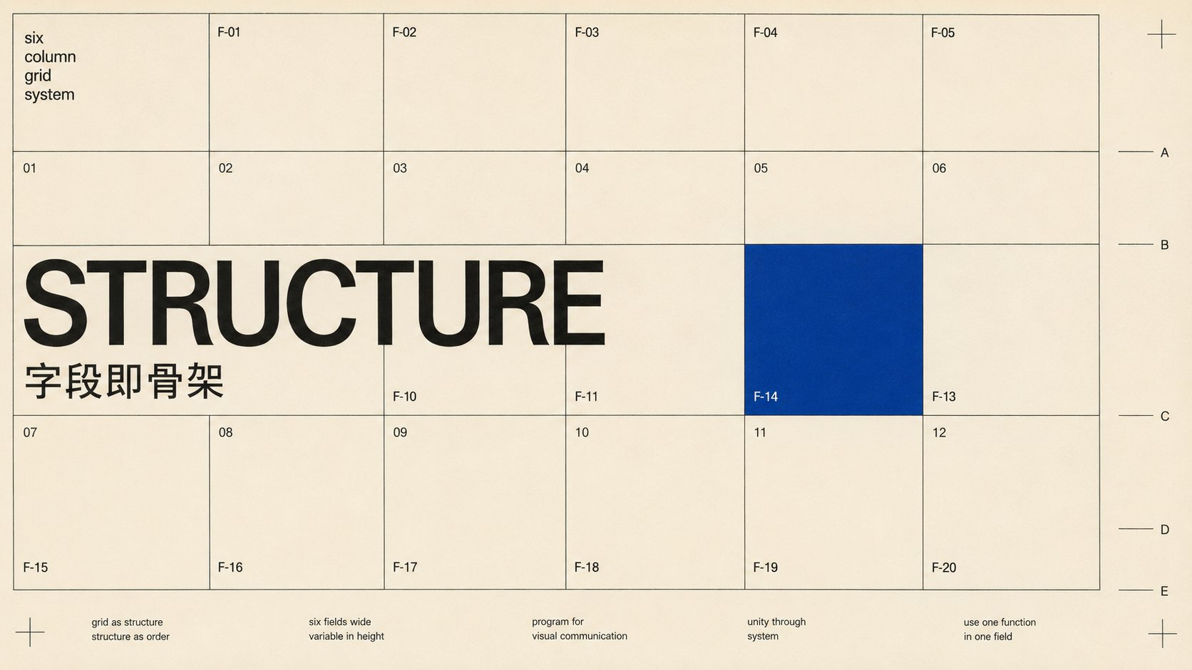
案例四:STRUCTURE · 网格场域 / 米白黑蓝(Karl Gerstner)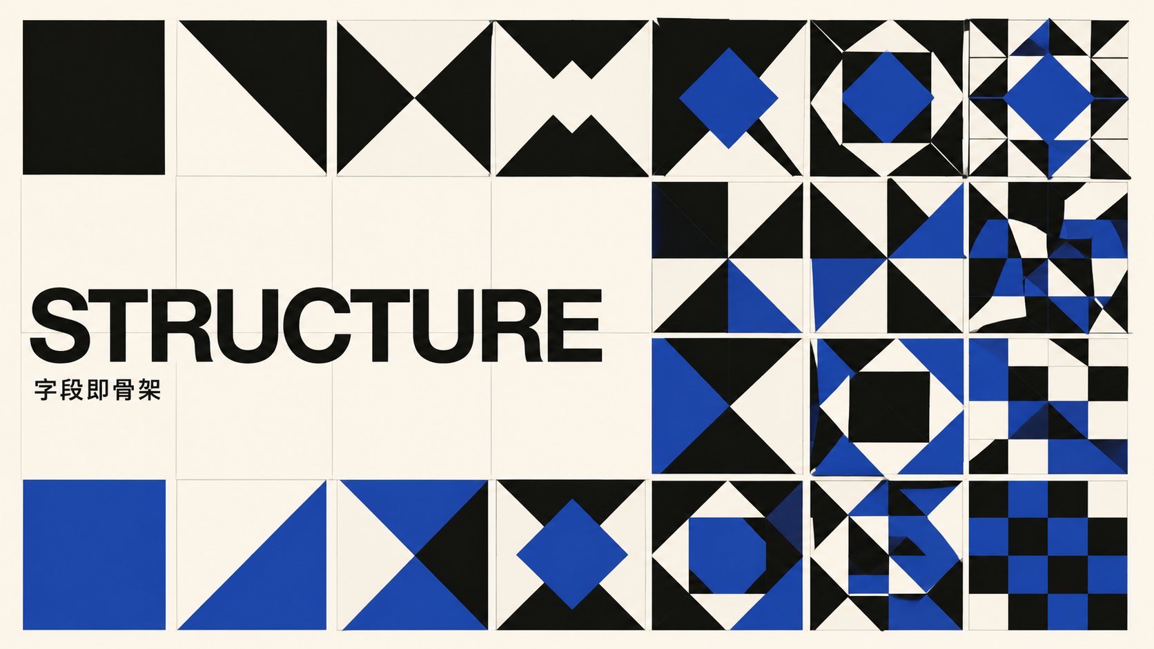
STYLE ANCHOR — in the manner of Karl Gerstner: programmatic design, systematic parametric grid variation.

A 16:9 landscape Swiss International Typographic Style poster — authentic 1950s offset print.

LOCKED — everything aligns to one underlying modular grid; one grotesk sans-serif family only; flat color with hard edges; no gradient, 3D, shadow, texture or ornament; objective, rational, asymmetric.

DOMINANT VISUAL — the layout grid shown as modular fields, type-led, with one cobalt field indicating structure; a series of fields systematically related by one fixed rule.

COLOR — warm off-white field; black; one flat cobalt blue field used structurally. Hard edges, no gradients.

TYPOGRAPHY — one neutral grotesk family, medium weight, tight optical spacing, two or three sizes; hierarchy by scale and position, not decoration.
  · Latin headline "STRUCTURE" placed across the left columns on the grid, grid-aligned; small Chinese line 「字段即骨架」 on the same grid nearby.

GRID & SPACE — the modular grid governs every element; negative space is structural, balanced, grid-defined.

SECONDARY LAYERS — add controlled secondary and tertiary layers (thin rule lines, small Latin field labels such as F1 / 01 / INDEX, modular numbers, alignment marks, tiny captions) to read as a genuine Swiss field system while staying rational, objective and grid-locked.

TEXT — main title must render exactly: "STRUCTURE" and 「字段即骨架」. Small grid-aligned Latin field labels (F1 / 01 / INDEX / MODULE), numbers and thin captions are encouraged here — functional, like a Swiss editorial information system; no random dates, URLs, fake brand names, long paragraphs, QR codes or decorative icons; avoid small Chinese for secondary text.

AVOID — Bauhaus module matrix / pattern board; De Stijl primary-color blocks; Op Art spiral; data-chart / bar-chart look; brand-style diagonal ribbon or logo-like single form without grid function; modern minimalist AI poster; PowerPoint / brochure template; gradients; 3D; drop shadows; vintage grunge; heavy / bold display CJK type.

QUALITY — authentic 1950s Swiss offset print, sharp edges, precise alignment, flat color.
案例五:ORDER · 同心弧 / 红(Müller-Brockmann,强传播封面向)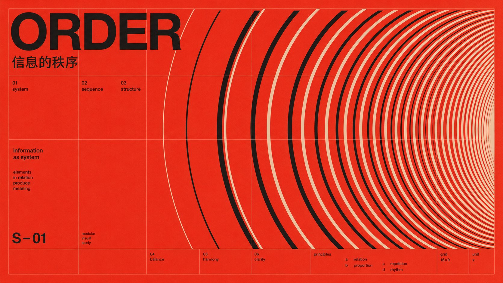
STYLE ANCHOR — in the manner of Josef Müller-Brockmann's 1950s Zürich concert posters: mathematical grid, systematic geometry, type as structure.

A 16:9 landscape Swiss International Typographic Style poster — authentic 1950s offset print.

LOCKED — everything aligns to one underlying modular grid; one grotesk sans-serif family only; flat color with hard edges; no gradient, 3D, shadow, texture or ornament; objective, rational, asymmetric.

DOMINANT VISUAL — a dense progressive series of dozens of concentric arcs on mathematical progression, flat-painted, radiating from the right, filling the field with rhythm and density, never a single bullseye.

COLOR — flat saturated vermilion red field; black and warm off-white only. Hard edges, no gradients.

TYPOGRAPHY — one neutral grotesk family, medium weight, tight optical spacing, two or three sizes; hierarchy by scale and position, not decoration.
  · Latin headline "ORDER" placed large across the top-left columns on the grid, grid-aligned; small Chinese line 「信息的秩序」 on the same grid directly beneath it.

GRID & SPACE — the modular grid governs every element; negative space is structural, balanced, grid-defined.

SECONDARY LAYERS — add controlled secondary and tertiary layers (thin rule lines, small Latin field labels, modular numbers, alignment marks, tiny captions) to increase editorial richness while staying rational, objective and grid-locked.

TEXT — main title must render exactly: "ORDER" and 「信息的秩序」. Small grid-aligned Latin field labels, numbers, index marks and thin captions are allowed — functional, like a Swiss editorial information system; no random dates, URLs, fake brand names, long paragraphs, QR codes or decorative icons; avoid small Chinese for secondary text.

AVOID — Bauhaus module matrix / pattern board; De Stijl primary-color blocks; Op Art spiral; data-chart / bar-chart look; brand-style diagonal ribbon or logo-like single form without grid function; modern minimalist AI poster; PowerPoint / brochure template; gradients; 3D; drop shadows; vintage grunge; heavy / bold display CJK type.

QUALITY — authentic 1950s Swiss offset print, sharp edges, precise alignment, flat color.
案例六:CRAFT · 功能性破格 / 米白橙(Wolfgang Weingart)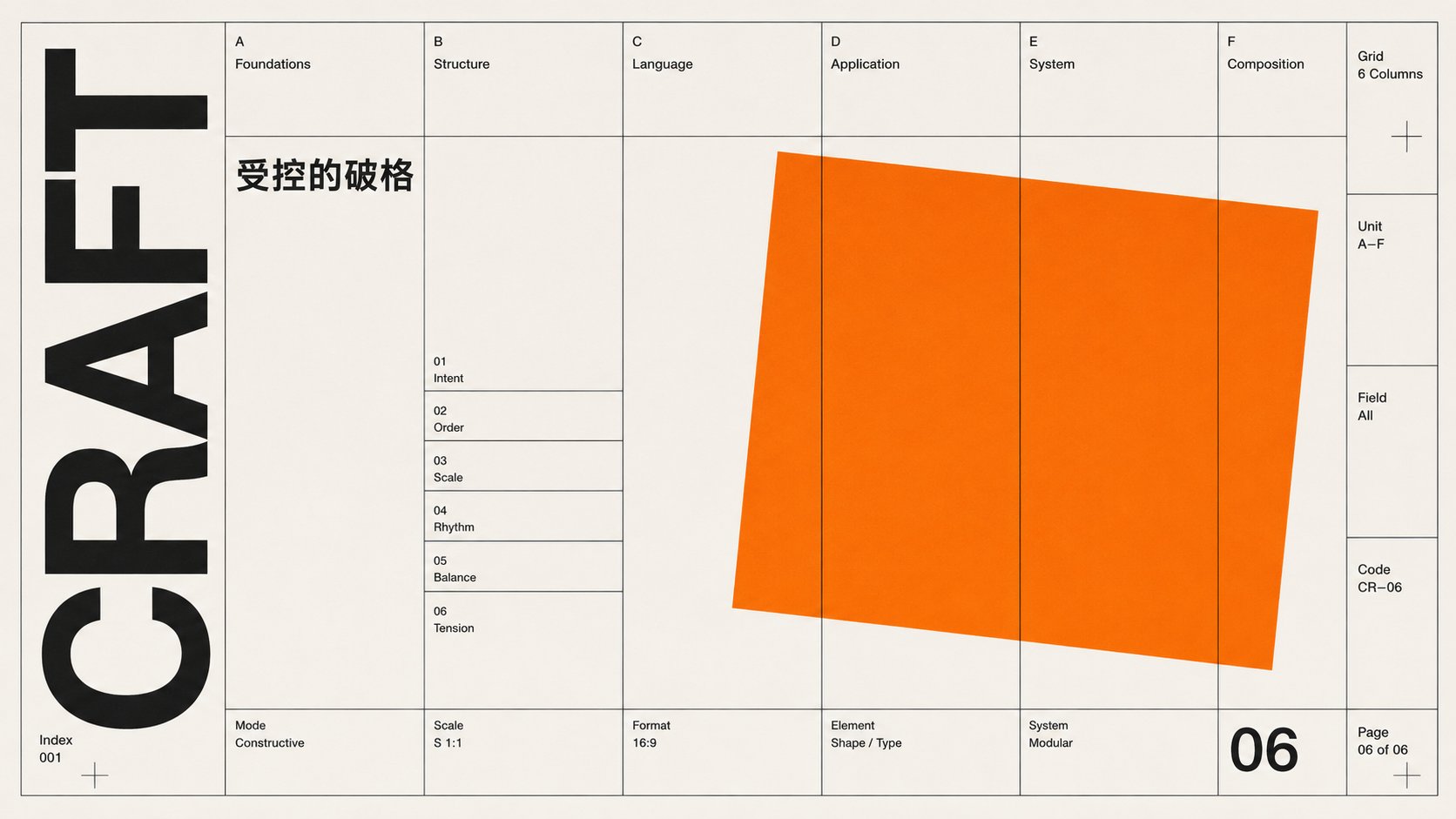
STYLE ANCHOR — in the manner of Wolfgang Weingart: Swiss New Wave, one controlled rule-break, layering.

A 16:9 landscape Swiss International Typographic Style poster — authentic 1950s offset print.

LOCKED — everything aligns to one underlying modular grid; one grotesk sans-serif family only; flat color with hard edges; no gradient, 3D, shadow, texture or ornament; objective, rational, asymmetric.

DOMINANT VISUAL — a strict grid as base with one deliberate rule-break: a single flat orange rectangle rotated a few degrees and layered over the grid, still functioning as a structural field; everything else strictly aligned.

COLOR — warm off-white field; black; one flat saturated orange accent. Hard edges, no gradients.

TYPOGRAPHY — one neutral grotesk family, medium weight, tight optical spacing, two or three sizes; hierarchy by scale and position, not decoration.
  · Latin headline "CRAFT" set vertically along the left margin on the grid, grid-aligned; small Chinese line 「受控的破格」 on the same grid nearby.

GRID & SPACE — the modular grid governs every element; negative space is structural, balanced, grid-defined.

SECONDARY LAYERS — add controlled secondary and tertiary layers (thin rule lines, small Latin field labels, modular numbers, alignment marks, tiny captions) to increase editorial richness while staying rational, objective and grid-locked.

TEXT — main title must render exactly: "CRAFT" and 「受控的破格」. Small grid-aligned Latin field labels, numbers, index marks and thin captions are allowed — functional, like a Swiss editorial information system; no random dates, URLs, fake brand names, long paragraphs, QR codes or decorative icons; avoid small Chinese for secondary text.

AVOID — over-broken layout; Bauhaus module matrix / pattern board; De Stijl primary-color blocks; Op Art spiral; data-chart / bar-chart look; brand-style diagonal ribbon or logo-like single form without grid function; modern minimalist AI poster; PowerPoint / brochure template; gradients; 3D; drop shadows; vintage grunge; heavy / bold display CJK type.

QUALITY — authentic 1950s Swiss offset print, sharp edges, precise alignment, flat color.
非常感谢您能看到这里👇除了上文中的多种固定提示词之外,这是更加灵活自由的skill版本: FANzR-arch/image-prompt-skills
我将瑞士国际主义的设计语言拆成了基础的几个设计模块,复制给你的AI安装好后,只需要输入你的需求,比如:
横板5:2,生成一张瑞士风格文章封面,标题是:信息的秩序。AI会识别分析你的意图,自动匹配生成更为合适的提示词,欢迎尝试,欢迎与我交流~
我是阿哲Phil,"一个自由的提示词诗人"欢迎关注我 @Formulasearch,我会持续分享:用AI解码美学 × AI实践 × 增长心得