
真的不是红黄蓝的几个色块就叫包豪斯了... 更何况颜色也是要搭配的。
提示词写 Bauhaus style,模型就只能回收最表层的符号:红色方块、黄色圆形、蓝色三角形、巨大的无衬线字母和一点复古纸纹。
这些元素不是错,但它们只是结果,不是机制。真正的问题是:你有没有告诉模型,为什么这些形状、颜色、字体和空间关系能成立。
这篇的核心判断很简单:
风格名只是入口,AI 成图质量取决于能不能把风格拆成可执行的视觉关系。
包豪斯不是「高级极简」,也不是「红黄蓝几何模板」。更准确地说,它是一套现代设计训练:把艺术、工艺、工业生产和日常生活重新接在一起。
所以这篇不追求讲全包豪斯,只讲一件事:怎么把包豪斯拆成可以直接用于 AI 生图的媒介、结构、材料和功能关系。
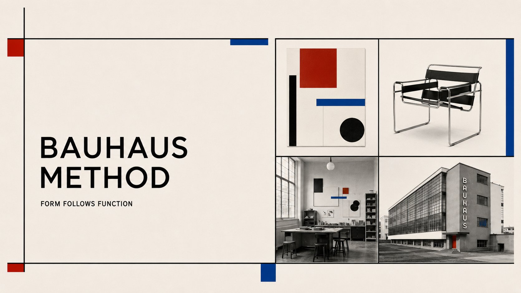
什么是"包豪斯"
包豪斯先是一所现代设计学校,也是一套设计教育方法。它 1919 年创立于德国魏玛,1925 年迁至德绍,1932 年迁至柏林,并在 1933 年关闭。
它的影响范围不只包括建筑,也包括工艺、产品、字体、舞台、摄影、印刷和平面视觉。Bauhaus-Archiv 把它放在「工艺训练、工作坊、基础课程、材料、形式、色彩、空间」的教育语境里;Bauhaus Dessau Foundation 的年表则显示,德绍阶段明显转向「艺术与技术的新统一」和面向工业生产的原型开发。
放到 AI 生图语境里,可以先这样理解:
包豪斯是一种把现代生活重新设计一遍的方法:从海报、椅子、灯,到房间和建筑,都要回到功能、材料、结构和清晰表达。
这里要抓住一件事:圆形不是装饰,它可以做视觉重心;线条不是装饰,它可以划分信息区域;方块不是装饰,它可以压住画面重量;标题也不是后期贴字,它可以参与版式结构。
适用场景
输出方向是否适合为什么海报、文章封面、标题视觉最适合几何、字体、色彩和留白容易形成强识别产品、家具、灯具、小型器物适合包豪斯有明确的工作坊、材料和工业生产语境室内、工作室、展览空间适合家具、灯具、墙面、色彩和动线可以组成完整生活场景建筑外观、学校、工作坊、住宅体块适合但要单独写建筑要处理体块、采光、窗带、功能分区,不要套海报词品牌基础系统、栏目封面、系列视觉适合有利于建立重复使用的视觉语法人物故事、疗愈内容、奢华叙事、运动动员不优先包豪斯的结构感强,不适合承担柔软情绪、华丽戏剧性或强动员气质
使用边界只有一条:包豪斯可以跨媒介,但不要混写。
海报写排版和几何;产品写材料、结构和功能;室内写家具、光线、动线和色彩;建筑写体块、立面、窗带和功能分区。
核心视觉特征拆解
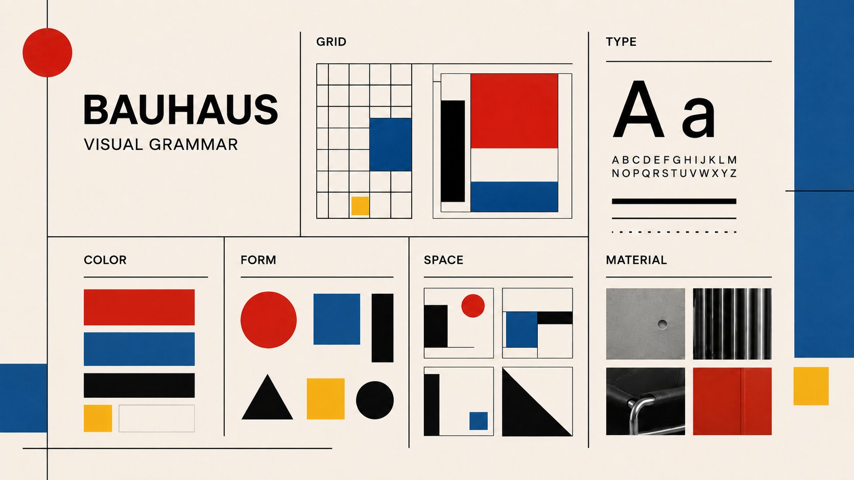
构图 / 体块
做海报时,不要把圆、方、三角撒在画面上,要让这些基础形状进入版面结构。
产品、室内和建筑方向,要把「构图」改写成体块、构件和空间关系:椅子的管材框架,灯具的球体和金属杆,房间里的家具模块,建筑里的玻璃幕墙、窗带、楼梯、桥廊和功能分区。
常见的有效构图关系包括:
- 大形做视觉锚点;
- 色块划分标题区和信息区;
- 直线建立阅读方向;
- 斜向结构制造实验感;
- 非对称关系让画面保持张力。
strict geometric composition, asymmetric grid, circles squares triangles and straight lines used as structural layout elements
字体 / 文字关系
文字不能像后期贴上去的标题。它要参与构图。
Herbert Bayer 的 universal lettering 相关实验值得参考,原因不在某个具体字体,而在它把字母看成一套可简化、系统化、几何化的视觉工具。MoMA 2009 年的 Bauhaus 展览视觉文章也提到,设计团队参考 Bayer 的 universal lettering,把字母形式和网格、墙面、色彩边界一起处理。
提示词里要写清楚:
oversized sans-serif headline integrated into the geometric layout, typography as composition, clear hierarchy between headline and small supporting labels
色彩
红、黄、蓝、黑、白或米白确实常见,但堆满颜色只会浮于表面。更稳的原则是:颜色必须服务结构。
红色做视觉重心,黄色做信息区,蓝色做平衡块,黑色压住文字重量,米白给结构留出呼吸。
如果颜色平均分布,画面会变成儿童积木。 如果颜色过度做旧,画面会变成复古海报模板。 如果颜色只是点缀,结构感会不够。
limited red yellow blue black off-white palette, color used for hierarchy and structure, flat color blocks with hard edges
图形 / 构件
图形要承担任务,不能只是凑元素。跨到产品和空间后,图形会变成构件:圆形灯罩、钢管框架、矩形窗带、模块柜体、白墙上的色彩面。
有效图形通常有四种功能:
- 视觉锚点:让画面有主重心;
- 信息分区:划出标题、说明、辅助标签的位置;
- 方向张力:用斜线、三角形、垂直字轴制造运动感;
- 标题框架:让文字和几何互相咬合。
geometric forms as visual anchor, section divider, title frame, and directional tension
留白
留白不靠多少取胜。它要让形状、文字和信息之间的关系更明确,成为结构的一部分。
generous negative space, strong alignment, balanced margins
材质 / 质感
海报方向默认保持平面、干净、印刷感。不要一上来就加复古纸纹、胶片刮痕、脏噪点、阴影和 3D。结构还没成立时,质感只会遮住问题。
flat color blocks, clean print-like surface, no paper texture, no vintage noise, no gradients, no glossy 3D
产品和空间方向要改写材质:钢管、玻璃、白色抹灰墙面、木材、皮革或帆布、金属灯罩、清楚的结构连接。不要把它做成赛博金属、豪宅大理石或北欧软装。
情绪气质
包豪斯封面的气质偏理性、实验、清楚,接近设计学校的展览海报,像一个系统正在被拆解。
避免误用
- 把包豪斯等同于红黄蓝几何模板。
- 把 Bauhaus 93 之类后来的商业字体当成历史包豪斯字体本身。
- 把建筑、家具、钢管椅、玻璃幕墙直接塞进平面封面提示词。
- 把复古纸纹、做旧印刷当成风格核心。
- 只写 Bauhaus style poster,不写几何、字体、层级、留白和禁止项。
- 把它写成瑞士国际主义:过度中立、过度网格、缺少基础几何和字体实验感。
提示词编译方法
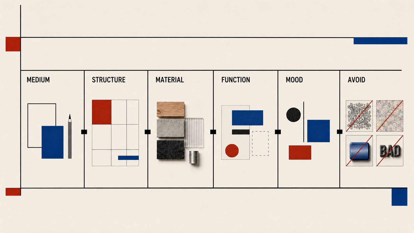
到这一步,只需要做一个动作:先选媒介,再复制骨架。
提示词不要从 Bauhaus style 开始,因为这个词太大,模型会自动滑向最常见的表层符号。更稳的写法是先告诉它:这次要生成海报、产品、室内,还是建筑。
稳定骨架是:
媒介 + 用途 + 历史/视觉锚点 + 结构规则 + 材料/色彩规则 + 信息/功能关系 + 情绪气质 + 禁止项
先选媒介,不要混写
媒介提示词重点不要混进来海报 / 封面几何构图、字体、色彩层级、留白、文字控制钢管椅、玻璃幕墙、室内软装产品 / 家具功能、材料、结构连接、可生产性、几何轮廓海报排版、大标题、随机图形贴纸室内 / 展览空间家具模块、灯光、白墙、色彩面、动线、开窗平面海报网格、假文字、装饰图案建筑非对称体块、功能分区、水平窗带、玻璃幕墙、桥廊、采光红黄蓝贴面、复古海报质感、家具特写
历史锚点只抓四个就够了:1919-1933 的学校脉络、德绍阶段的工业生产转向、Joost Schmidt 1923 年展览海报里的几何和文字关系,以及 Herbert Bayer 的 universal lettering 实验。
完整提示词结构
先复制骨架,再按媒介替换变量。媒介一混,模型就会把海报字体、家具、建筑立面和室内软装塞进同一张图。
TITLE: "这里填封面标题"
ASPECT RATIO: 4:5 / 16:9 / 1:1
USE: article cover / poster / illustration

Create a Bauhaus-inspired visual using the title, aspect ratio, and use case specified above.

STYLE: Bauhaus graphic design, 1920s modern design-school poster, exhibition typography, not generic minimalism.
LAYOUT: strict asymmetric grid, basic geometry used as structure, strong typographic hierarchy, clear negative space.
TYPOGRAPHY: use the provided title as the main oversized sans-serif headline, integrated into the layout. No long body text.
COLOR: limited red, blue, black, and off-white palette; flat hard-edge color blocks; color used for hierarchy and structure.
SURFACE: clean print-like finish, no paper texture, no vintage noise, no gradients, no glossy 3D.
MOOD: rational, experimental, disciplined, modern design-school feeling.
AVOID: random geometric stickers, decorative red-yellow-blue template, Bauhaus furniture, white architecture, fake dates, fake body text, ornate patterns.
结果检查
跑图后不要只看「像不像包豪斯」,要看模型有没有理解这四件事:
- 媒介有没有选对:海报看版式,产品看结构和材料,室内看家具、光线和动线,建筑看体块、立面和采光。媒介错了,风格再像也不稳。
- 功能有没有变得可见:海报要看出信息层级;家具要看结构是否合理;房间要看出使用功能;建筑要看出功能体块。
- 材料有没有克制:产品和建筑不能只靠红黄蓝贴面。钢管、玻璃、白墙、木材、皮革、帆布、金属灯罩,比颜色更能支撑风格。
- 有没有滑向邻近流派:太整齐、太 Helvetica,会滑向瑞士国际主义;太斜、太红黑,会滑向构成主义;太纸纹、太怀旧,会滑向泛复古海报。
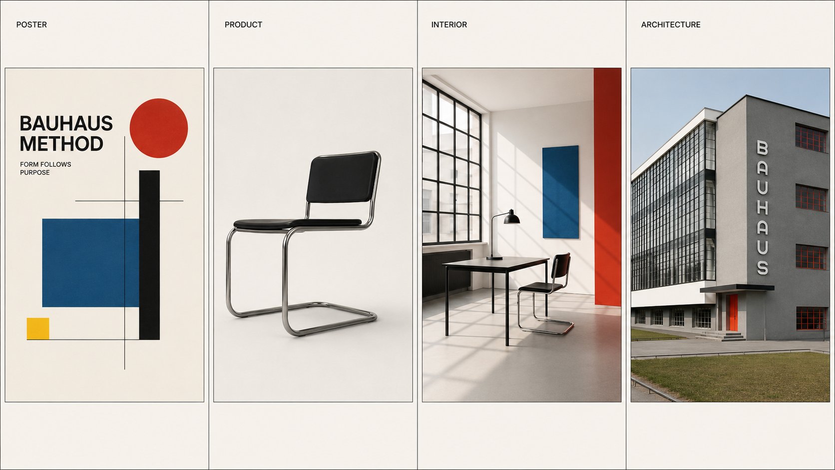
案例演示(待生图 + 复制即用提示词)
下面四套可以直接复制。它们不是四个版本的同一条提示词,而是四个媒介方向。先选一个方向,再替换用途、主体和文字。
案例一:POSTER · 海报封面
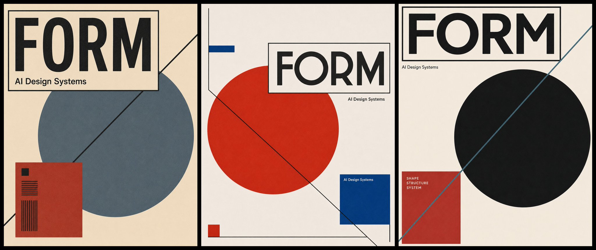
TITLE: "AI Design Systems"
ASPECT RATIO: 4:5
USE: editorial article cover

Create a Bauhaus-inspired visual using the title, aspect ratio, and use case specified above.

STYLE: 1920s Bauhaus graphic design, modern design-school exhibition poster, experimental typography, not generic minimalism.
LAYOUT: strict asymmetric grid; one large circle as visual anchor, one rectangle as title frame, one diagonal line for movement, one solid color block for information hierarchy. Shapes must organize the page, not decorate it.
TYPOGRAPHY: use the provided title as the main oversized sans-serif headline, integrated into the geometric layout. Add only one small supporting label if needed. No long body text.
COLOR: limited red, blue, black, and off-white palette; flat hard-edge color blocks; color used for hierarchy and structure.
SURFACE: clean print-like finish, generous negative space, balanced margins.
MOOD: rational, experimental, disciplined, modern design-school feeling.
AVOID: random geometric stickers, red-yellow-blue template, Bauhaus furniture, white architecture, vintage grunge texture, gradients, shadows, glossy 3D, fake dates, random text.
案例二:PRODUCT · 产品 / 椅子
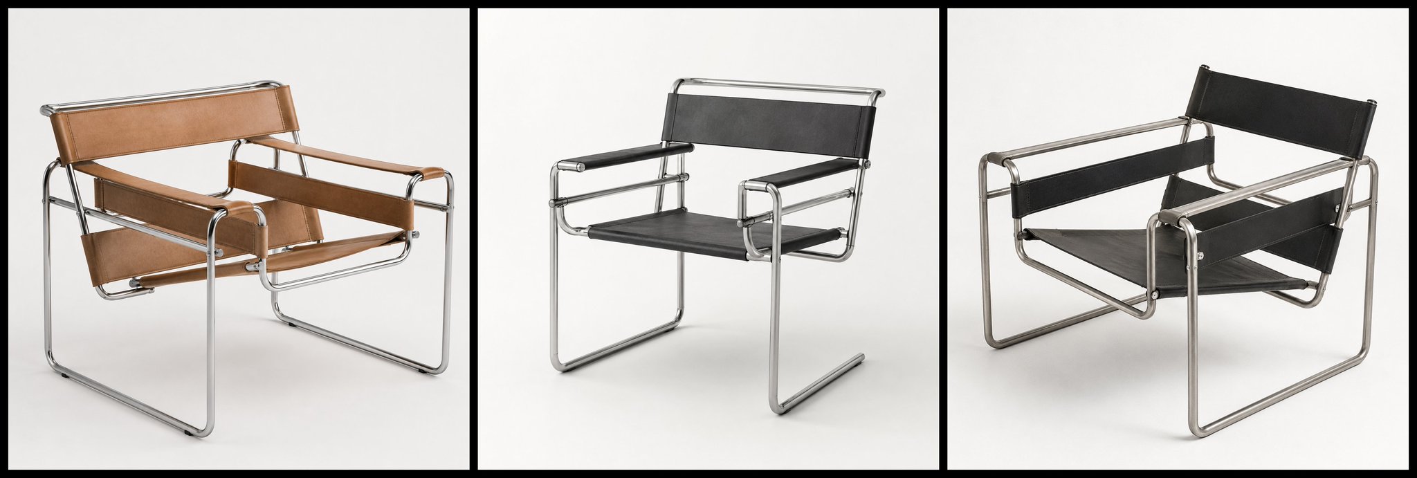
STYLE ANCHOR: Bauhaus product design, workshop prototype feeling, inspired by tubular steel furniture and functional modernist objects, not a decorative poster style.
A square product render of a Bauhaus-inspired lounge chair for a creative studio.
STRUCTURE: lightweight tubular steel frame, clear right-angle geometry, suspended leather or canvas seat straps, visible joints, honest construction, no ornament. The object should look functional, manufacturable and structurally logical.
MATERIALS: brushed chrome or black tubular steel, black leather or natural canvas, minimal wood or rubber details only if functional.
COLOR: mostly black, steel, off-white; one small red or blue accent allowed only on a functional connector or tag.
SETTING: clean white studio background, soft daylight, no lifestyle clutter.
MOOD: rational, light, precise, modern design-school prototype.
AVOID: red-yellow-blue stickers, decorative triangles, luxury upholstery, thick cushions, sci-fi metal, glossy concept car surfaces, ornate legs, fake text.
案例三:INTERIOR · 室内 / 工作室
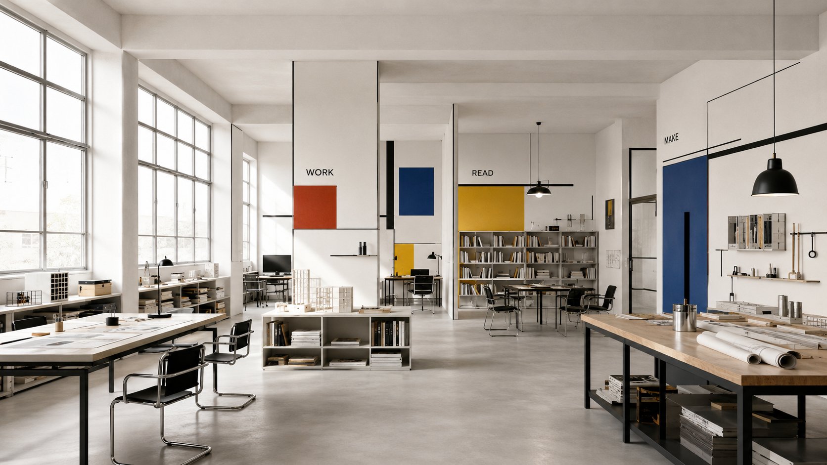
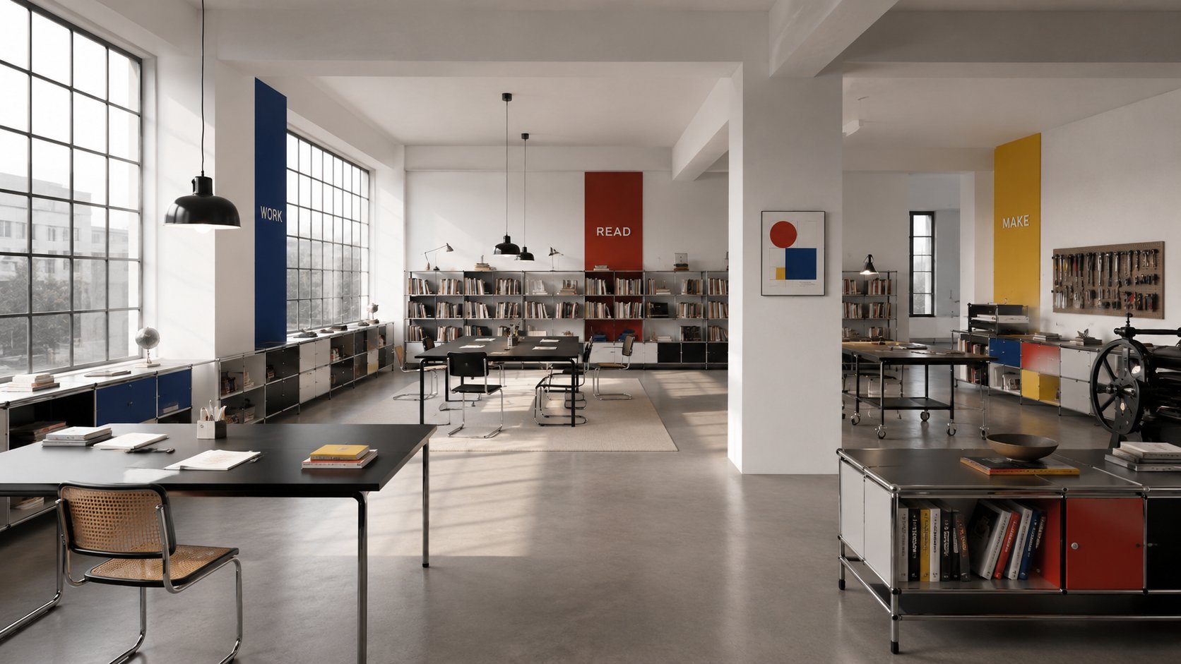
STYLE ANCHOR: Bauhaus interior design, modern design-school studio, functional furniture, workshop clarity, not Scandinavian decor.
A 16:9 interior view of a Bauhaus-inspired design studio and reading room.
SPACE: white plaster walls, large horizontal windows, open plan, clear circulation, modular shelving, simple work tables, tubular steel chairs, functional pendant lamps, visible relationship between furniture and use.
COMPOSITION: rectangular room modules, strong horizontal and vertical lines, furniture arranged by function, generous open floor area, no decorative clutter.
COLOR: warm off-white, black, steel, natural wood; controlled red yellow blue accents only as wall panels or object labels.
LIGHT: bright natural daylight, clean shadows, no cinematic darkness.
MOOD: disciplined, calm, useful, experimental, school-workshop atmosphere.
AVOID: cozy boho textiles, Scandinavian hygge, luxury marble, ornate art wall, random primary-color stickers, futuristic sci-fi lighting, fake typography.
案例四:ARCHITECTURE · 建筑 / 学校体块
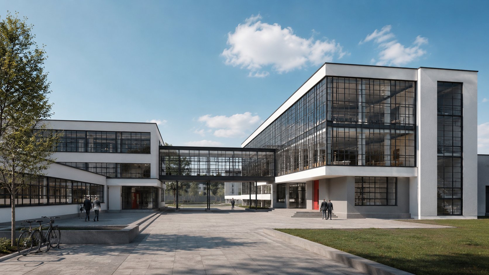
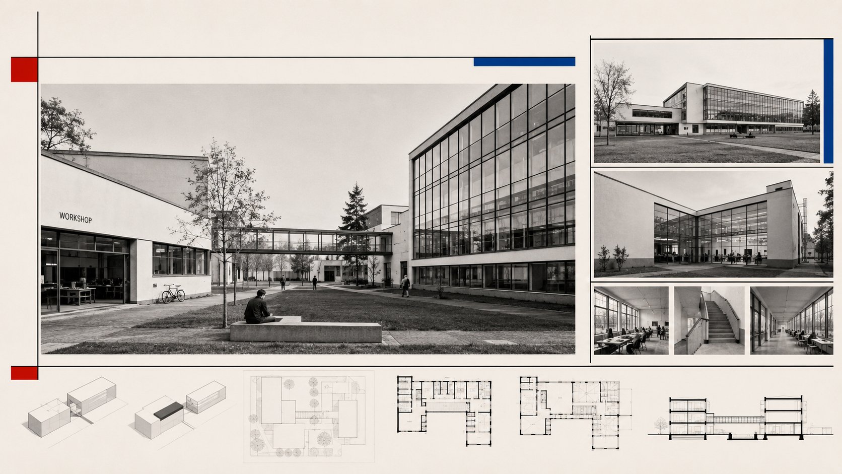
STYLE ANCHOR: Bauhaus architecture, Dessau-era modern design school, functional volumes and industrial clarity, not a red-yellow-blue facade.
A 16:9 exterior view of a Bauhaus-inspired design school building.
MASSING: asymmetric functional volumes, flat roof, white plaster planes, reinforced-concrete frame logic, bridge-like connector, clear separation between workshop wing, studio wing and public hall.
FACADE: large glass curtain wall for workshop space, horizontal window bands, exposed stair or balcony elements, no historical ornament.
MATERIALS: glass, concrete, white plaster, black steel frames, restrained warm interior light.
SITE: simple campus courtyard, clean pavement, a few trees, human scale but no crowd.
MOOD: transparent, rational, educational, light, industrial-modern.
AVOID: primary-color facade stickers, luxury villa, brutalist fortress, skyscraper, ornate columns, cyberpunk lighting, random signage, furniture close-up, poster graphics pasted on walls.
下次再写 Bauhaus style 之前,先问四个问题:
- 这次生成的是海报、产品、室内,还是建筑?
- 几何形状是在装饰,还是在组织结构?
- 材料和颜色有没有服务功能?
- 画面有没有让功能变得可见?
这四个问题答清楚,提示词才不会停在风格表面。